The standard convention is to depict arteries in red and veins in blue. I've followed this convention with my hand structure, and it now has some nice blue veins to go with the palm arteries.

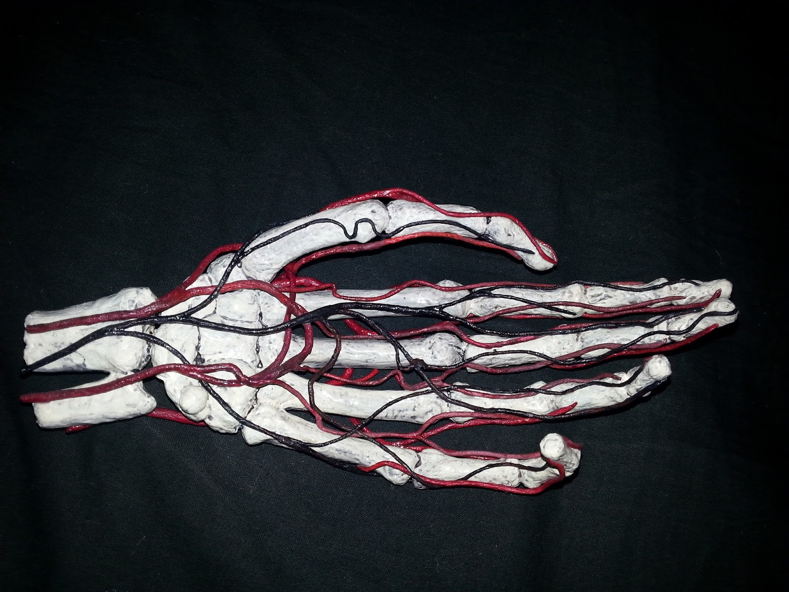
I'm really pleased with my hand's vascular system. I like to think those twisting, curling blood vessels capture the look of the real thing. They have a nice, organic sense of movement that's very satisfying. Compared to the vascular system of a real hand, this is simplified, because I don't want it to be all veins and arteries with the bones hidden underneath them. The bones need to be visible too.

This next photo is taken from the side looking at the thumb, and shows how the blood vessels twist around the bones.

And here's another shot of the palm. Having little blue veins as well as the arteries looks better, because that's what we expect to see and because having both the red and blue colours gives the sculpture more depth.
That's all I'll be doing with the vascular system for now, but I want to use this hand as part of a relief sculpture and the background will echo the shapes of the hand's blood vessels.
Comments
Post a Comment